
You’ve got a website. Maybe it even looks half-decent. But here’s the brutal truth: if it’s not converting, it’s not working. Most visitors decide in less than 3 seconds whether to stay or bounce. So if your bounce rate’s through the roof, it’s time to ask the hard question – is your website scaring off your customers?
1. Your Site Loads Like It’s on Dial-Up
No one wants to wait. If your website takes more than 3 seconds to load, you’ve already lost nearly half your visitors. Speed matters. Slow sites scream “outdated” and “unreliable.”
Fix it: Compress your images, ditch bloated plugins, and use proper hosting. Run your site through Google PageSpeed Insights and follow the advice.
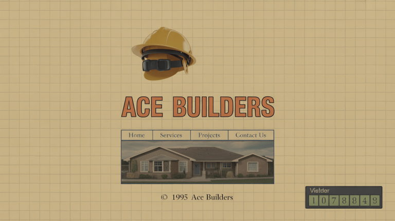
2. It Looks Like It Was Built in 2005
If your website looks like a school IT project, you’re telling visitors you’re not professional. Harsh but true. Design is trust. A clunky layout, outdated fonts, and pixelated images send people running.
Fix it: Go clean and modern. Use white space. Use high-res visuals. Stick to two or three brand colours max. Mobile-first design is a must – over 60% of visitors are on phones.
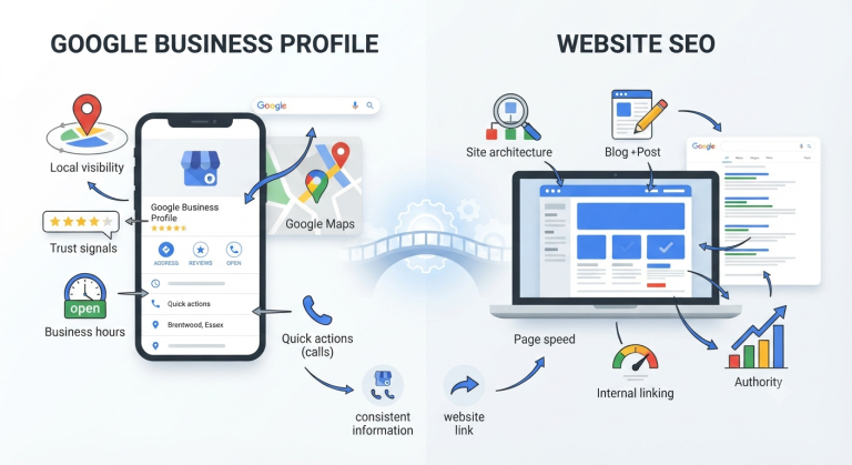
3. It’s Not Mobile Friendly
Ever tried navigating a desktop site on your phone? Pinching and zooming like it’s 2010? It’s a conversion killer. Google also punishes non-mobile-friendly sites in search rankings.
Fix it: Use responsive design. Test your site on different devices. Prioritise readability and easy thumb-tapping.
4. You Confuse Visitors with Clutter
Too many menus. Too many pop-ups. Ten different calls to action. Visitors don’t know where to look, so they leave. A confused mind doesn’t buy – it bounces.
Fix it: Simplify. Stick to one clear goal per page. Remove anything that doesn’t support that goal. Guide visitors like you’re holding their hand.
5. Your Copy Sucks
If your copy is dull, vague, or full of jargon, you’re wasting precious attention. People don’t read websites – they scan. If they can’t figure out what you do in 5 seconds, they’re gone.
Fix it: Write like you speak. Be clear. Be punchy. Focus on what’s in it for them, not what you do. Use headlines that stop them scrolling.
6. You Have No Trust Signals
Would you buy from a company with no reviews, no contact details, and no security? Neither would your customers. Lack of trust = lost sales.
Fix it: Add real testimonials, partner logos, accreditations, and trust badges. Show your face – people buy from people, not faceless businesses.
7. There’s No Clear Call to Action
You’ve explained what you do, but now what? If you’re not telling people what to do next, they’ll do nothing – or worse, go to a competitor who does.
Fix it: Make your CTA buttons big, bold, and specific. “Get a free quote.” “Book a call.” “See our prices.” And don’t bury them at the bottom – repeat them.
8. You’re Hiding the Important Stuff
Visitors come looking for something – your services, your prices, your phone number. If they have to hunt for it, they’ll give up. This isn’t a game of hide and seek.
Fix it: Put key info front and centre. Have a clear menu. Keep contact details at the top and bottom of every page. And yes – include your prices or at least a guide.
9. It’s Full of Errors
Broken links. Typos. Missing images. These tiny things scream “unprofessional” to anyone paying attention – including Google. They chip away at credibility fast.
Fix it: Check your site monthly. Fix dead links. Proofread everything. Use a plugin like Broken Link Checker or tools like Ahrefs or Screaming Frog to scan.
10. It Feels Like a One-Way Street
If your site is just shouting information but offers no way to engage, you’re missing out. Modern users expect interaction – chat, forms, social proof, videos.
Fix it: Add a contact form. Integrate a live chat or chatbot. Use video where it helps. Let people interact, ask questions, or book easily.
So What Does a Great Website Look Like?
It’s fast, modern, clear, mobile-first, and built to convert. It shows people what you do, why it matters, and what to do next. It builds trust instantly. And above all – it makes life easy for your visitors.
Want a checklist? Here you go:
- ✅ Loads in under 3 seconds
- ✅ Looks great on mobile
- ✅ Clear, scannable content
- ✅ Obvious calls to action
- ✅ Trust signals (reviews, badges, etc.)
- ✅ Clean, simple design
- ✅ Functional contact form or booking option
What Now?
If you’re not sure where to start, have someone outside your business do a quick test. Ask them: “What do we do, and what should you do next?” If they hesitate, your site needs work.
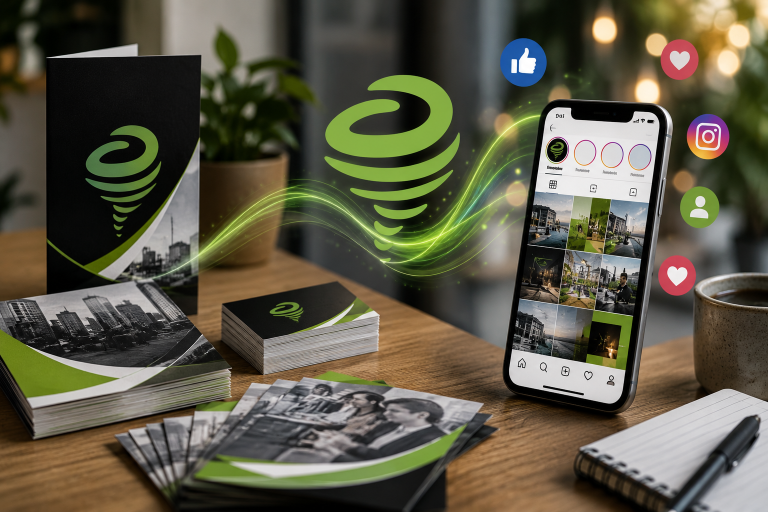
And if you want professional help – no fluff, no jargon, just results – that’s what we do at Green Tornado. We build websites that don’t just look good, they perform.
Let’s fix your site and turn it into your best salesperson.
Conclusion
A bad website doesn’t just look embarrassing – it loses you money every single day. Don’t let yours be the reason people go elsewhere. Fix it once, and reap the benefits long-term. Your customers (and your bottom line) will thank you.