The Network Magazine has a proven track record as a primary source of information on local businesses in the areas we distribute to.
Network Magazine came out for the first time in May 2004, and since then it has gone from strength to strength.
The magazine was originally called the Shenfield Network, and it was sent to only 2,500 homes.
In 2008, the three magazines were combined into one called “The Network Magazine.” Since then, it has been hand-delivered to over 18,500 homes in Brentwood, Shenfield, Hutton Mount, Billericay, Ingatestone, Ingrave, and Herongate.
Network Magazine has been very successful because it has given local businesses a way to increase their visibility in the area that has been tried and tested. It has also been a fun alternative to local newspapers and leaflet distribution, giving businesses a place to advertise once a month so they can find new customers in the local community.
The Brief
The network magazine had a very old and outdated website that did not seem to reflect the new and bold company they are now. It was not responsive and did not work on mobile phones. Having the website work on all devices was important to them, as many people searched using mobile phones and the Network Magazine did not want to miss any new clients.
Having a way for customers to visualise how many roads they delivered to and a smart way to show the quality and value for money the Network Magazine gave was important.
Having a backlog of past magazines to explore in a fast and efficient manner was also needed very much as before they had only text links that provided no information to the user visually. Seeing the magazine front cover would help the customer or user decide if they had chosen the correct edition.
What we did
LOGO
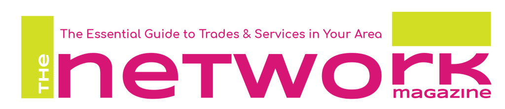
We created a bold striking logo which was easy to read, easily recongnisable, paving the way for new branding, incorporating different colours and fonts for a complete facelift throughout the magazine.
WEBSITE
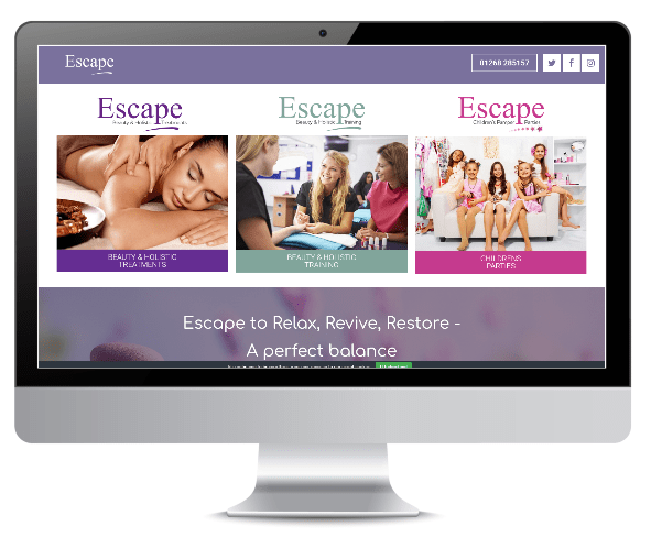
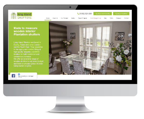
The website was instantly transformed, using new colours and fonts. We also made navigating the website for potential advertisers much easier, with clear links to the advertising rates, contact page and previous editions for online readers to ‘flick through’. The home page was stripped right back, with easy to read bullet points and graphics to illustrate the magazine and all it has to offer. The customer also needed to be able to upload new editions and blogs to the site each month, to keep it updated regularly, so we provided an easy to use system, which they found very useful.
SEO
The Network magazine want to attract local business from Brentwood, Shenfield, Hutton Mount, Ingrave, Herongate, Billericay and Ingatestone area mainly. We focused our attention to those areas and created content to advertise those areas.
The keywords changed slightly over the months to incorporate more areas.
The website was technically overhauled and schema was introduced giving google more information.
The Google my business page was updated regularly, and our list of over 80 SEO improvements was gradually completed.
DESIGN
We provided The Network Magazine with stationery including letterheads, compliment slips, business cards and envelopes. We also created A4 folded leaflets as part of their promotional marketing material.
Client Feedback
LOGO
The customer was really pleased with the finished logo. They said it breathed new life into the cover of the magazine and opened the door to a complete new look to the magazine as a whole. Excellent use of colours and the font was perfect.
WEBSITE
Feedback regarding the website was tremendous, with much praise regarding the navigation side of it. They were really happy with how easy it was to find information about the magazine and how you could view all the previous magazines in just a click of a button. They also loved the fact that it all tied in with the new branding and allowed their magazine to stand out from similar publications with the use of an up-to-date, easy to use, functional website.
SEO
The SEO is certainly improving every week, and is now appearing on the first page of google for 12 of the keywords out of the 15 chosen.
Our site is faster, cleaner and easy to use.
DESIGN
We are very happy with all the local flyers that we have chosen Green Tornado to produce. Customers choose to advertise with us because our designs are bright and easy to understand, this is due to Green Tornado’s understanding of local business.